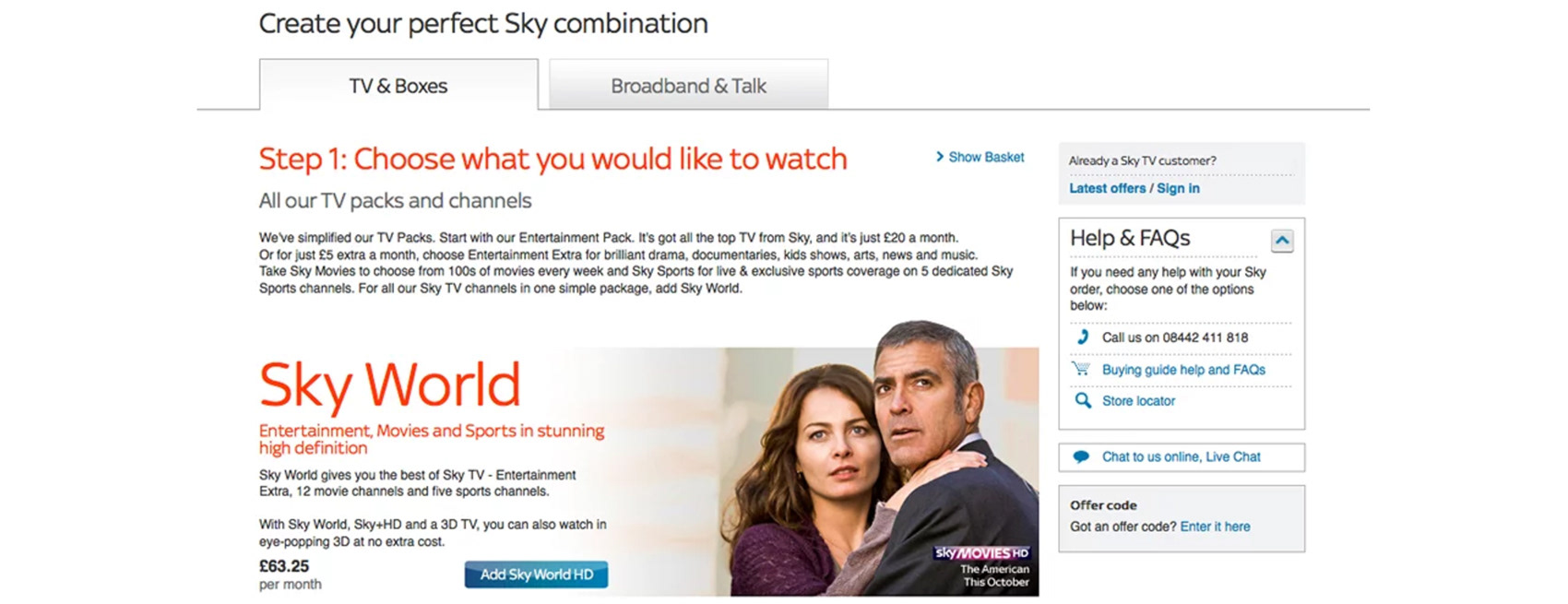
As part of Sky’s online strategy, there was a major focus on moving sales out of the contact centre and increasing the performance on their online shop. A key part of this was achieved by providing the customer with a simple, clean and intuitive online journey. I was tasked with creating the designs to improve the conversion and usability of the purchasing process; included the “product selection” and “order summary” pages, along with a redesign of the shopping basket function and checkout.
The work was split over four phases to allow for a “test and learn” approach to respond to customer feedback. I created a multi-tab structure that enabled the customer to purchase Television, Broadband as well as highlighting the benefits of purchasing both together. A great deal of work went into adopting the correct visual styling and tone of voice to simplify a very complex set of products and business rules.
As the senior designer, I was responsible for pitching creative concepts to the stakeholders, design implementation, interface design, user flows and interaction. I worked directly with the client and product delivery managers to ensure the design brief was met, through to ensuring the developers had assets to start building.
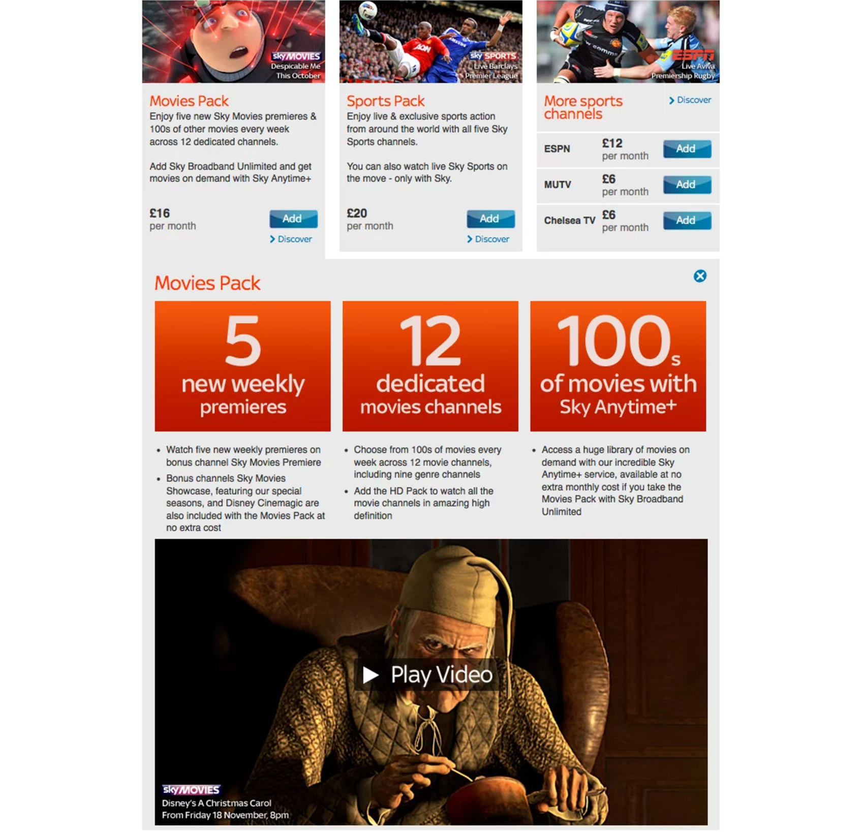
Adding extra packages
Below is an example of the expanded module the customer would see when they click on "Discover". It reveals more about the product, and includes a monthly teaser clip.
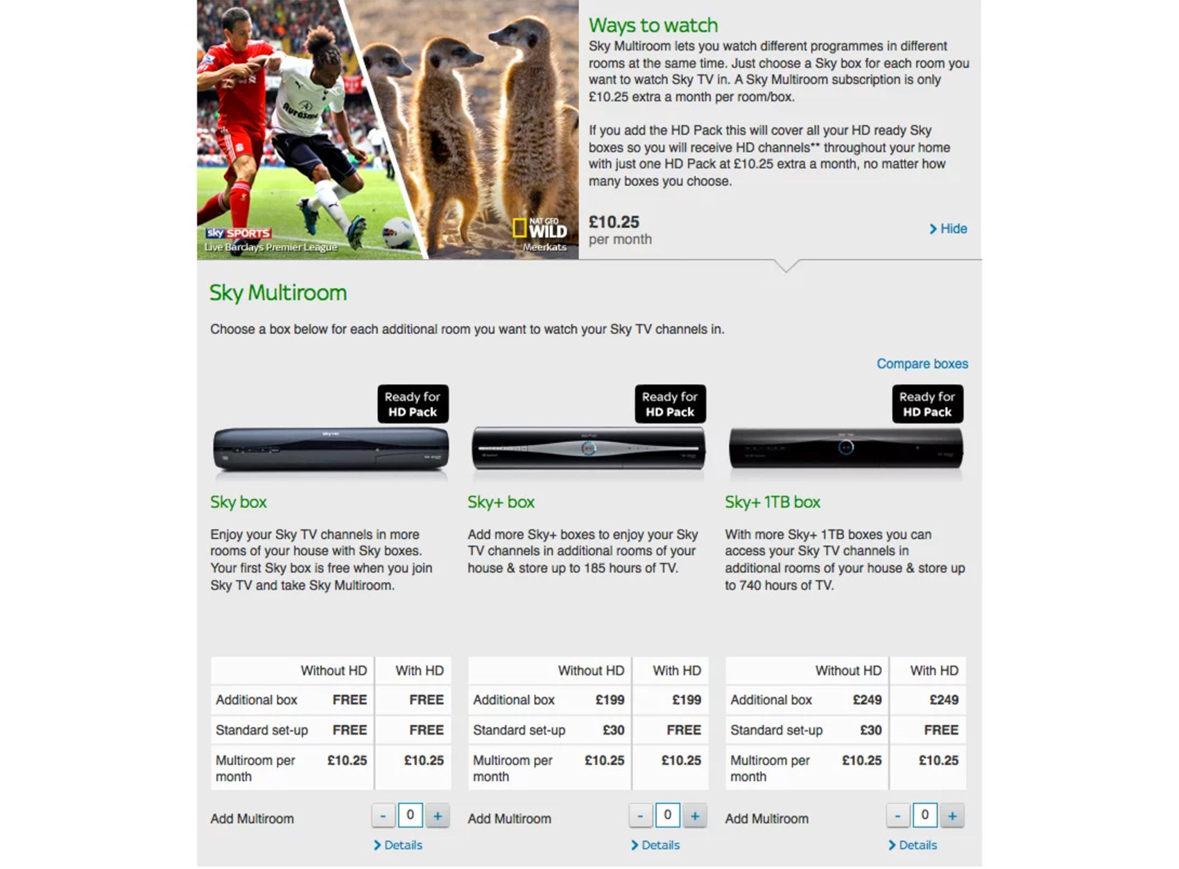
Box comparison
Experimented with various layouts to help the customer decide which sky box was right for them and to up-sell multiroom.